FILMENT LIGHTING:
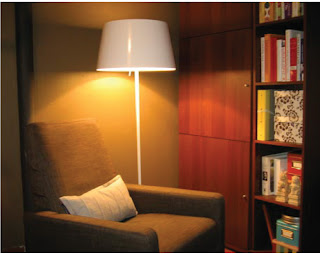
[a] residential=> reading space
[b] task lighting=> reading
[c] filiment lighting => floor lamp
[d] floor lamp with filament bulb
[e] this lamp creates an ambiance within the space and allows the user to complete the task of reading.
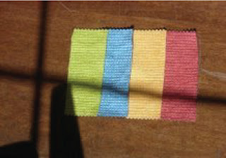
[f] this particular light creates a warmer space by enhancing the paint color and wood grain. It also allows you to see the details within the fabrics.
[g] i feel that illumination is very appropriate. i like the space
[h] to improve the space i would debate whether to incorperate lighting within the shelving unit.
ELECTRODELESS:
[a] growth => mocking sunlight
[b] task lighting
[c] electrodeless
[d] large lamps that absorb light and mock sunlight into concentrated spaces.
[e]this lighting allows the growth of plants and gives them sunlight.
[f] allows its inhabitants to live
[g] i think the ilumination level is very appropriate and does the tast effeciently.
[h]n/a
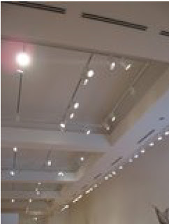
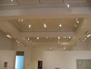
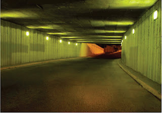
SOLID STATE:
[a] traffic tunnel
[b] task/accent lighting
[c] solid state lighting
[d] solid light contained within itself
[e] the lighting guides ou through the space and allows for visual interest.
[f] the lights create a sense of repitition through the space
[g] i think the illumination level is okay, however it could be a little brighter
[h]n/a
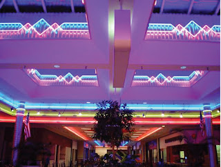
COLD CATHODE:
[a] commercial => food court
[b] this lighting is accent. it is used to create interest and mood.
[c] cold cathode =>linear
[d] linear bars
[e] these lights draw attention to the ceiling and provide a sense of signage.
[f] the colored lights reflect on eachother and create this purple glow in the space. the other materials do not stand out because of the intensity of the cold cathode.
[g] i feel that this space is overwhelming for a food court. i don't think that it's appropriate and is too over the top.
[h] i think the different colors could be reduced and not used in such excess.
HID:
[a] studio=>learning environment
[b] task lighting
[c] HID lamps
[d] pendant lighting
[e] the lights allow for easier visual identifications. they light the space well and are not distracting
[f] the lights create little glare. they absorb into materials
[g] i think the illumination level is very appropriate. it lights the space well and is not distracting.
[h] being in this space a lot, i don't have a problem with the lighting.
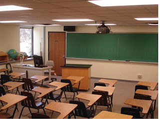
FLOURESCENT:
[a] classroom=> learning environment
[b] task lighting
[c] flourescent bulbs
[d] long bulbs
[e] the light source is fairly boring and dull and isn't lit very well.
[f] the lighting reflects off the surfaces and create glare.
[g] i think the illumination level is appropriate but the natural light produces more efficient light.
[h] for this environment, i would allow for more natural light.


 The retail store pacsun obviously has a lot of different items to display which allows for various lighting. Throughout the store, there are several rows of track lighting. This works well because of the variety of objects to be displayed. There are also special lighting fixtures [filament lighting]=>see picture below. These fixtures allow the space to be more personalized and comfortable. The fixtures create a textural element to the space and also reflect a certain mood because of the fixtures characteristics. When you walk into the space, one of the 1st things you notice is an illuminated shelve that displays products. I think it works very well and is very appropriate. Above the check out area there are rectangular suspended light fixtures. I really like this fixture because it shows the importance of the area without using signage. The light is a yellow shade and directs the customers eye. Overall, I think that this space is extremely successful. I think the lighting techniques for display work well and do not take away from the product. Some fixtures create visual interest but still fit in with the theme and mood of pacsun. However, most of the light is contained within more effective if they incorperated lighting between shelving. All in all I feel this space is very effective and successful.


 [a] residential=> reading space
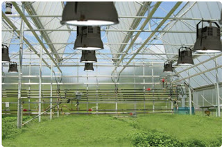


